DCL Poster Concept - from rough sketch to finished ink drawing
I meant to post this a long time ago, and thought I would do so now. Better late than never!
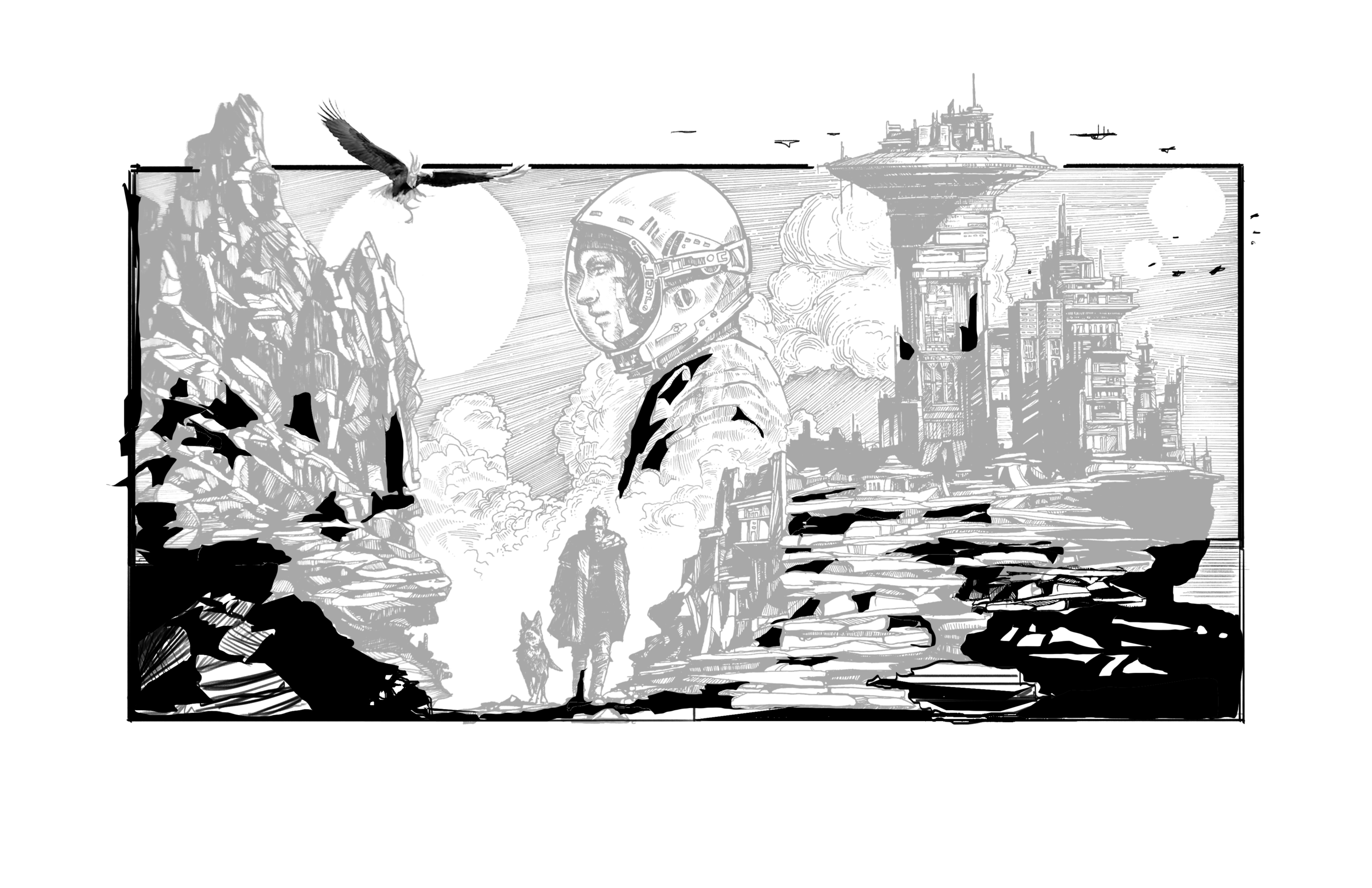
Here is a medium-size ink drawing for a poster concept for The Dead City Lullabies. It was a very slow and careful process to create this drawing, and I’m still really happy with it. The final piece measures about 75cm x 54cm.

The process was as follows:

1. As always, a couple of very rough thumbnails to nut out the composition…

2. Next, I created a photo-bashed mockup in Photoshop (using elements from old drawings of mine, and some reference imagery), then printed that onto several A4 sheets and stuck it all together on top of a lightbox.

3. Laying out the mock-up on the lightbox.

4. Tracing the main shapes onto the art paper…

5. The finished tracing.

(note: this dude on the right never made it to the final ink drawing… wonder why? I honestly don’t remember why I scrapped him. Maybe it threw the composition out a bit…)

6. Commencing the process of inking. I use my mockup printouts for reference as I go…

7. A full day’s work up until this point, about 8 hours…

8. Another full day’s work, and it’s nearly done. But now I think I need to expand the bottom half a bit. Because of the “widescreen” frame of the sky that I chose for the composition, it now looks a bit top-heavy with all those hatch marks, and the rock work looks like it spills out of the frame. Like, crazily. So….
9. I take a photo of the drawing as-is, and then do some work in Procreate on the iPad to mock up how I can extend that frame downwards in a satisfying way, to balance it out again. Once I’m happy with how that’ll look, I go back to the inks…

10. Dammit! My finger had a bit of india ink on it, and I smeared the beautiful white paper just below the border. I thought of using that area as the signature block, but the positioning was stupid. So, I very carefully scraped away the ink with a super-hard hi-polymer eraser. You’d have to look closely on the final piece to notice anything amiss. A lesson: keep your hands clean, and use a scrap of paper to rest your hand on while you do delicate ink work!

11. And that’s the final image. Not sure if it’ll be used for the graphic novel itself, but it’s a cool concept piece. And I’ll probably either frame it or sell it (or both!) at some point.
Thanks for reading, as always.
x A